As You Were

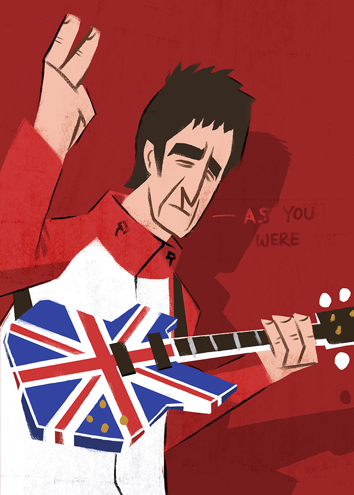
Noel Gallagher commission. This one, like the Hamilton piece, was for the client’s grandson, and again the brief was very open ended. I felt inclined to go for Gallagher in his prime with the iconic Union Jack guitar, track suit, and of course the “V for victory” gesture. The composition was tricky here as I went back and forth on whether to keep things tight and close-up or whether to go for a full body shot, but ultimately the fully body just didn’t fit well on the page. The guitar was a bastard to get right as well!

Cheers

Matt

You’ll Be Back!

Commissioned Hamilton piece. The client wanted this one for her grandson who is big into theatre. I tried not to be too literal and draw an actual theatre (or some such scene) and instead opted for something a little more nuanced. I’d been told the client’s grandson liked Hamilton and so I went and gave it a watch since I’d just bought Disney+. I don’t know much about theatre, but that which I have seen has really been a mixed bag – though I must say I love The History Boys – however, after watching Hamilton I was blown away. What an amazing show! If you’ve seen the production then the character above should be immediately recognisable, and while only appearing briefly, it’s fair to say he stole the show. For those of you not in the know the above illustration is of King George III who is played by Jonathan Groff (Mindhunter, Frozen) who sings the iconic “You’ll Be Back” with spit flying to boot. Anyway it felt appropriate that I pay homage to this guy and this was the most apt way I could imagine; as the King of Hamilton.

Cheers

Matt

What up Holmes?

Took some doing this one! I played around with how I would apply the colour for ages and ultimately settled on a screen-print style that I’ve mentioned previously, only upped the level with which I executed the aesthetic.

I really like the bookcase and with the head of Arthur Conan Doyle resting on top. To be honest I like how I’ve drawn everything except Holmes himself – he looks a little stiff – so this is something I’ll work on going forward.

Cheers

Matt

Last One… Honest

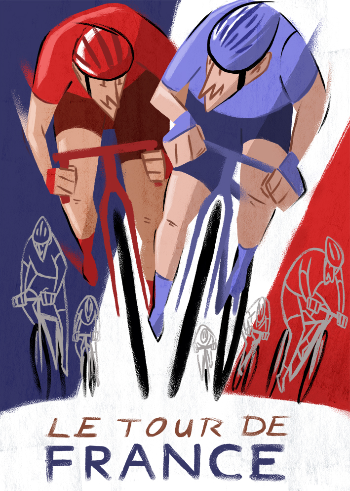
Last cycling piece for a while. I think this might be my favourite out of all these pieces. The composition works really well and the colour application has a screen-print aesthetic that I think compliments the piece. I was in two minds whether to fully render Mont Saint-Michel, but after a couple of tests I decided it was wiser to just stick to the line work and use the cloud as a way of giving the architecture some form. Its my hope that your eye is drawn to the white areas, specifically the cyclist first because of the small amount of black and white that comprise the character. This is because your eye is naturally drawn to negative space, sometimes known as the 80/20 rule. If you imagine a sheet of white paper with about 20 percent of the page covered by black, you will find your eye seeking out all the black areas. The same principle is being applied here with the black and white on yellow.

Cheers

Matt

Ha’Way the Lads

Another fun commission here! I’ve been very lucky recently in that most of the commissions I have taken on have had very open ended briefs, meaning I’m pretty free to do whatever I want with few limitations. The client wanted this one for their old piano teacher who is also a Sunderland AFC fan. I was originally inclined to do something similar to the Leeds Utd poster I illustrated a while back, which was very footballer heavy. Somehow that didn’t seem appropriate for this one, as the client wanted a fusion of piano and football. I went back and forth having a football scene float up out of the piano like music, but it felt a bit obvious. I did a bit more research in to the clubs musical history and found that the players walked out to “Dance of the Knights” by Sergei Prokofiev (if you’ve seen The Apprentice, with Alan Sugar, you’ll recognise the music as the intro that). After that I just sourced the sheet music and Bob’s your uncle. I particularly like the textures I’ve thrown in.

Cheers

Matt

New Orleans JazzFest

This was a really fun commission to do. The client wanted it as a present for a friend who is into jazz, and they simply asked that there be a woman singing and a guy with a sax in a jazz scene. After illustrating the two characters I felt that adding anything more to it than a bit of typography would ruin the composition. I went back and forth as to whether the singer should have a black or a white dress, but I think the white balances the composition quite well as it draws the eye. I added a bit of texture to give the piece that old/distressed look and then created the jazz logo so the poster would look authentic.

Overall I’m really pleased with this one, so it probably means no one else will like it, as typically any of my work that I dislike gets the opposite reaction. I feel like I’m hitting my stride with this style of character design at the moment and it doesn’t feel boring or gimmicky – a feeling I was getting about the houses I was going crazy with a couple months ago. Anyway, all I can do is keep beavering away and trust the process – Rome wasn’t built in a day.

Cheers

Matt

Editorial mock-up

This is just a bit of practice to see how my style might fit around an article – don’t try to read the text, it’s just made up rubbish to give the piece a bit of realism… I mean you can try if you want, but it might make your brain bleed.

I’ve been looking a lot at the work of Satoshi Hashimoto and Tommy Parker in the hopes that their skill and mastery of this type of work will rub-off on me, while being mindful not to straight-up copy their style. I ‘m trying to simplify the characters, shapes, and colours to make the illustrations striking and easily readable. I’m also focusing on drawing things from everyday life which tends to be a main-stay of these kind of pieces, the downside to this is that if I get too generic I could suffer from appealing everybody, which results in appealing to no one.

Cheers

Matt