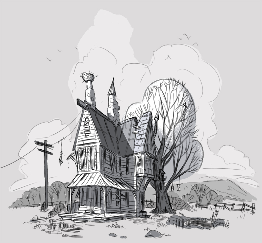
This is the first pass at some world building for the new project. Simply put, it is the location where the story takes place; an old abandoned farm house with an acorn tree at it’s rear. The acorn tree is primarily the home of a field mouse and a squirrel. As to what the story will be I have a vague idea, but mostly this will be an exercise in placing characters in interesting environments.
I’m not sure if the house looks abandoned or just poorly maintained, so I’ll probably make a few changes so it’s more apparent that no one lives there. I’ll also add a few pieces so you know it’s a farm house, such as a barn and old farming equipment.
A couple of very Disney-esq character designs. These were done mostly as a response to watching the Disney classic “Basil the Great Mouse Detective” which is still a great film, but looks really roughly animated when you compare it to some of its polished modern counterparts. The character designs seem basic, there’s less thought about peripheral characters (mostly they all look the same), the backgrounds are less interesting etc… These issues are mostly due to time constraints and the fact that Disney was still growing and learning. When you watch the modern animations, like Zootropolis, you really see how far things have come! Every piece of dialog has meaning, the environments are immersive and have hidden easter eggs for the eagled eyed viewer, the main characters are thoroughly work-shopped and designed, and the background characters all have a look and personality of their own too.
It’s a melancholy feeling watching those old animations because you love them so much, but you know Disney has moved on from hand-drawn animation and are unlikely to ever return to them, and that’s really sad. There’s something amazing about those hand-drawn films; maybe it’s nostalgia (in fact I’m positive it is) or maybe it’s like when you see a Rembrandt or a Van Gogh painting in the flesh instead of a print. Or maybe it’s the fact that there’s something sacred about knowing it’s all hand-drawn; the most fundamental way of drawing, the way everyone starts, the way the cavemen did it. Maybe it’s that.
Final spread (unless a publisher wants to approach me for a full book… hint, hint). To be honest all these pages have been very rough and the character design pretty elementary. There’s a definite Disney aesthetic to all the pages which wasn’t initially intentional, but certainly was in the last two spreads.
So what next? I think the background work in this one has been pretty weak, so I might attempt something with a greater emphasis on the environment that the characters live in…
I find myself talking about my process quite a lot in this blog, but there really is no substitute for a good old visual. So below is how I typically approach things. I’ll annotate as I go to fill in any gaps.
Step 1: (I’ve already jumped ahead here. There’s actually a stage before this where I will draw any ideas I might have for an illustration really loosely in a sketch pad. These are often nothing more than scribbles that you would be hard pressed to decipher, but they help with working out the composition). Ok, so basic character gesture drawings, very little detail. This step is purely the scaffolding that the rest of the illustration will be built around. Step 2: Refining the line work and adding detail to the characters. This can be pretty time consuming at the best of times, but even more so when you have multiple characters, and often requires a lot of rescaling and erasing. Step 3: Blocking-in. This is where I simply create blocks of shapes for the the largest shapes and characters (the background should be blocked in here as well). The block of colour creates a silhouette which all other colours are layered over later.Step 4: I’ve combined two steps here. 1 – specific areas of colour are added such as skin, hair, clothing etc… 2 – line work is further refined and coloured appropriately. Step 5: Final touches. This step can involve a variety of processes from adding texture and lighting to hand lettering and adjusting colour/contrast levels. For this piece I added some light and shadow overlays to the characters to give the scene and sunrise aesthetic, as well as more obvious additions such as clouds and text.
And that’s pretty much it! Hopefully that gives you some insight in to how I do things.
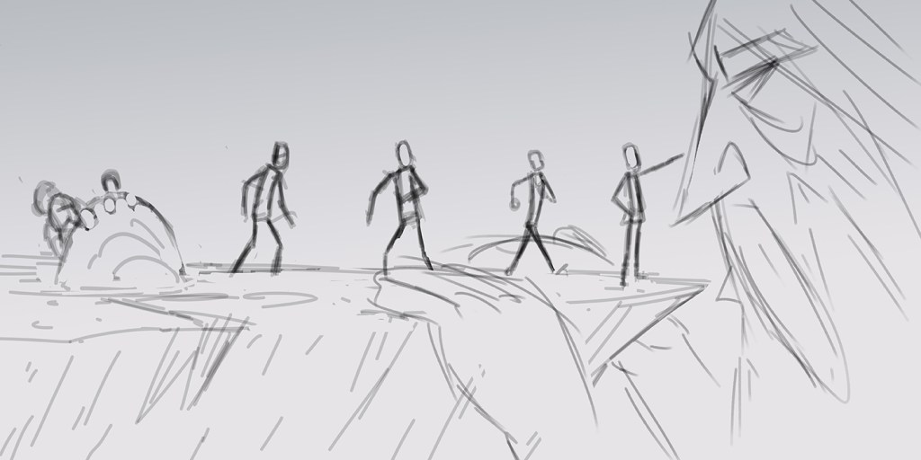
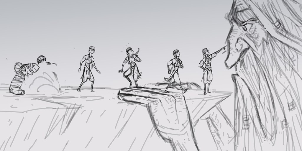
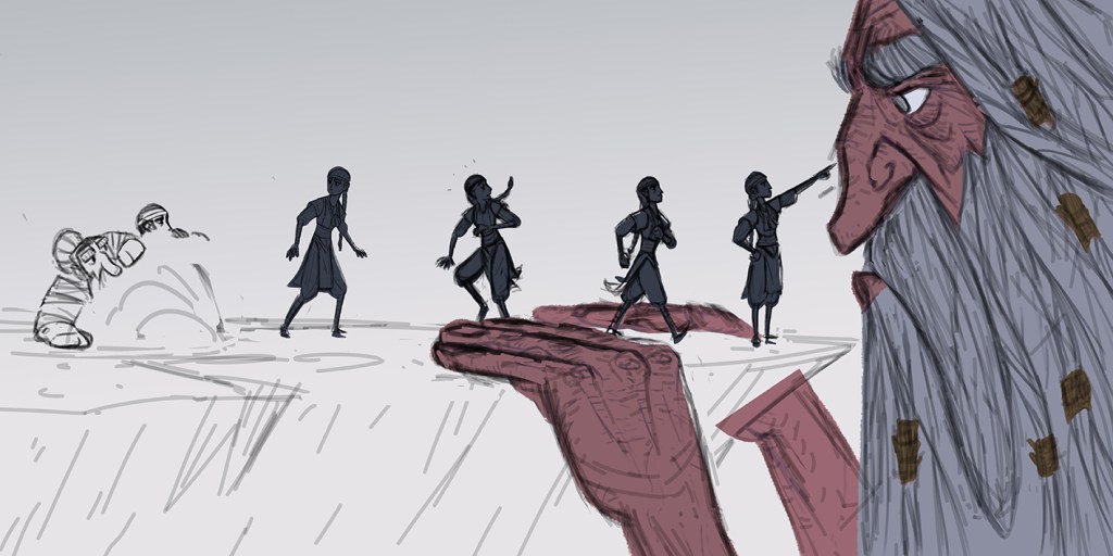
This isn’t really a character sheet… well it is because of how it looks here, but it’s actually a movement cycle for a double page spread that I’ll hopefully have done tomorrow. I should actually work on character sheets more I think if I want to work for Disney/Pixar/Dreamworks/Netflix as a character designer, so expect more of these! I’m pretty happy with this except for the face of the first figure (far left). I’ve been looking at the way a lot of the Disney (and similar studios) character artists work over the last couple of days, especially the likes of Annette Marnat https://annettemarnat.ultra-book.com/portfolio, Kevin Roualland https://rouaroua.tumblr.com/, and Brittany Myers https://rouaroua.tumblr.com/, check out their work!
After finishing the spread yesterday (bottom picture) and looking at it again this morning I couldn’t help but notice a few things that needed changing, so I’ve faffed about all day redoing the piece (top picture). Here’s what was wrong;
Firstly, Freyja’s right arm is massive! Look at the size of that monster! So I rescaled it so she would look more human.
Second, another Freyja issue was her features. The eyes, eyebrows, nose and mouth just seemed a bit odd and not quite in perspective, so again I corrected this and added white to the eyes.
Third was the trees. They seemed to lack any real texture and seemed a tad desaturated, so I found some old ink markings I made a while ago and applied those to combat the issue.
Fourth. Character shadows and highlights. I was going to avoid adding either of these but thought I’d add some bounce light from the snow and a bit of ambient occlusion. The problem is it looks a bit airbrushed now, so I might have to make another tweak.
Fifth. The writing was huge! I get that it’s a kids book so the text is meant to be big, but Christ! Resized it. Looks better.
I also changed the colour of the birds. This wasn’t really a problem, I just wanted to see what they’d look like white, and they certainly blend less with Thor. Added some icicles as well just for good measure.
If I’m honest I’m not over the moon with this spread. I think the main issue is that I find square compositions tricky to illustrate. I’ve noticed that many illustrators, when working with square compositions, either break the page up into two or three separate illustrations or they make the main focal point dead centre, so this is something I will bear in mind going forward.
Single page spread. Even though this is only a single page spread it took significantly longer to complete, mainly because it’s a little more refined than the previous spread and I also flip flopped on the design somewhat. I really like the environment in this one and I do rather enjoy illustrating trees, I think it must be good for your mental health or something. Again the text isn’t particularly well thought out, as it is merely saying what you can already see, but without the rest of the story it seems pointless adding exposition.
Double page spread for a possible kids book about the Norse god Freyja taming the boar Hildisvini. This is only a rough spread, but I do like how it’s looking. I tried to stay away from adding cast shadows and strong light because I think the colours work quite well and Freyja and the boar pop really well against the background. In case you’re wondering, the boar is meant to be the size of a horse because in the mythology Freyja rides him.
The text is just something I thought up super quickly and is by no means how it would read in the finished piece, it’s just to give publishers/agents an idea of where the text for the spread would sit.
I’ll keep rolling with this project until I’ve finished a couple more pages, so hopefully that won’t take more than half a week.
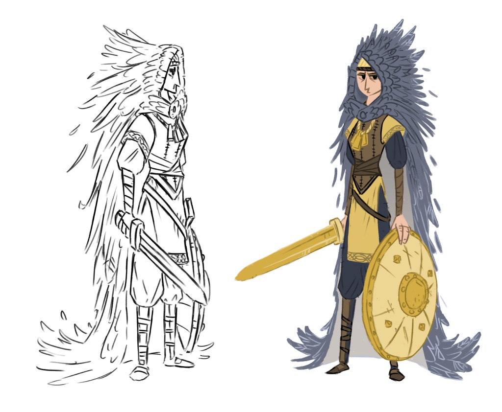
Freyja character design. This one was difficult, but is perhaps my favourite of the bunch so far. I seem to rarely draw women, so I often find myself having to relearn how to every time I make an attempt. In most forms of art it is well documented that you should “stick to what you know”, though somehow this advice is disregarded when it comes to character design, though I suppose this is because who wants to hire an artist who can only draw feet, even if said feet are really, really sexy (bad example, there’s all kinds of perverts out there. Yes, I’m looking at you).
Freyja (not ‘Freya’, as is the modern spelling) is a goddess associated with love, beauty, fertility, sex, war, gold, and seiðr. Freyja is the owner of the necklace Brísingamen and possesses a cloak of falcon feathers.
The challenge here was making the character fit the description above and also fit the aesthetic of the previous two characters, Odin and Thor. I chose to focus on beauty, war, and gold, while incorporating the necklace and cloak of falcon feathers. It felt too easy to draw the cloak with the hood down, which is how I had approached my initial sketches, and I wanted the character to stand apart from the other two who both have capes, so she had to be hooded. I used a lot reference of Viking shieldmaidens from Pinterest for the look of the leather armour and also got some prompts for the colour scheme from old traditionally painted versions of the character. I like the fantasy aspect of the cloak, but generally with these medieval type characters I like have one foot reality and so try to weave in how someone of that era would actually dress; tunic, tabard, sword belt, leather armour, all layered appropriately. There’s not a lot more to say on this one except that it was fun.
Thor character design. I had to play around with this one for a while because the proportions seemed out of sync and the colours were difficult to get right. It was also a challenge to stay away from the Marvel aesthetic of the character though I think there’ll always some similarities as there have been so many iterations in the comics over the years.