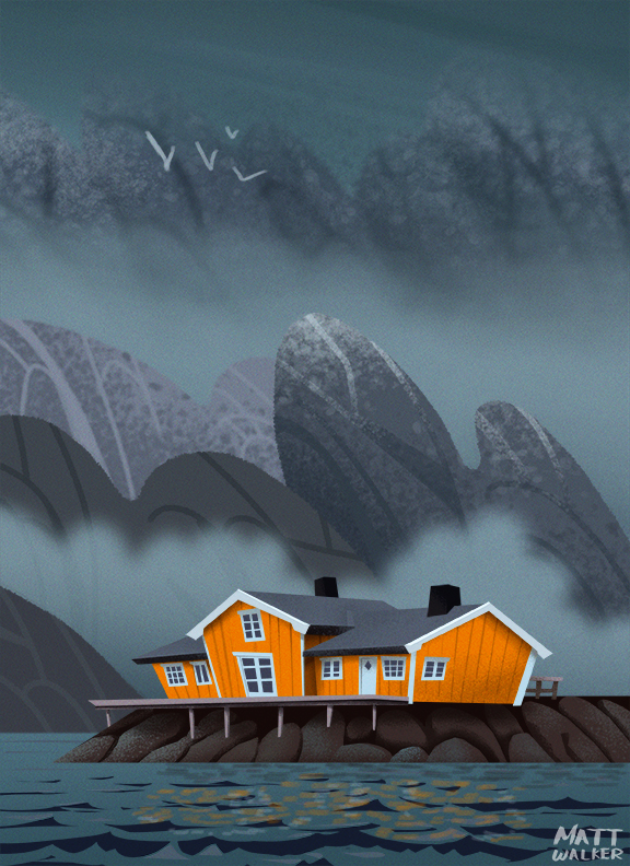
This is one of those rare occurrences where I actually like a piece I’ve made. I focused on simplifying and abstracting a lot of elements here because I often get into the habit of adding too much realism and detail. There’s nothing wrong with realism and detail, but a piece that should take a couple of hours can end up taking a whole day to complete and be none the better for it. The focus should be on capturing the essence of an object and allowing the viewer to complete the illustration with their own details, rather than making the piece so realistic that there is no room for interpretation. If you look at the backgrounds of popular animated shows like The Flintstones, Samurai Jack, and Scooby Doo, you don’t see a renaissance painting, you see abstract and simplified shapes.
Anyway, above is based on a place in Norway called Hamnoy. Enjoy!
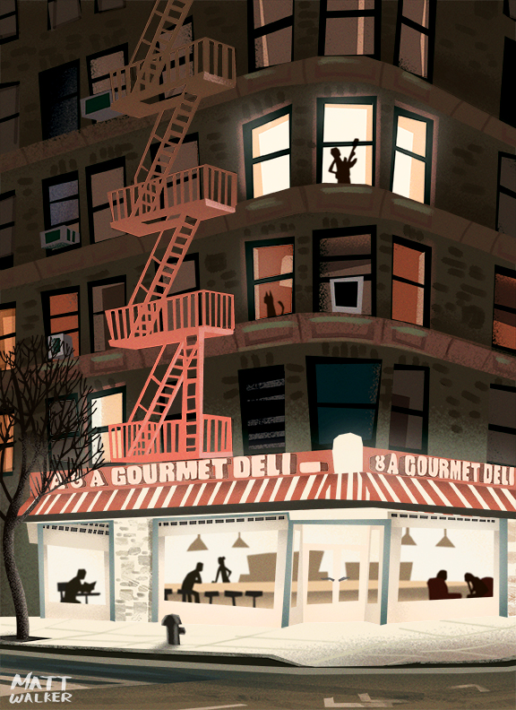
Just a quick study today. This one, unlike so many others, didn’t cause me any stress. I kept things super simple and didn’t go too crazy with the detailing. I found with this piece that I was initially drawing everything too precisely, so I had to go back and “correct” the shapes and proportions so they were wrong, which sounds weird to say, but it adds to the style. This is another place in NYC. I’ll probably get off the New York hype train at some point, but I just love the buildings! Enjoy!
I think there are moments in life when you know – just know – what it is you’re meant to do as a career. For years and years I struggled with this, always searching, always looking for something new. I tried a creative writing course because I love reading, and it was famously said “that all great writers are great readers”. But apparently I’m not much of a writer, or that is to say I didn’t have the patience for it. I learned to snowboard and thought perhaps I’d become a snowboard instructor, but that was just a flight of fancy. I love, absolutely and unconditionally adore American Football. When the season is in full tilt i’m glued to the TV. I’ve read the books, watched the films, I even play for a team in Yorkshire called The Doncaster Mustangs. If I lived in the states I’m positive I’d be doing something within the sport (not playing though, I’m a distinctly average athlete). I worked, and still do on a part-time basis, in the service industry and almost embraced it fully, as I had always liked – not loved, nor enjoyed – just liked the job and I was good at it to boot.
Seven years ago I watched a segment on TV where authors Neil Strauss and Tim Ferriss had a one on one discussion about their respective careers in writing. Ferriss asked Strauss what he thought was the key component to finding a career that you love. Strauss responded with this “There’s two things. Firstly, whatever you were doing when you were 11 or 12 that a parent or school teacher didn’t make you do is your passion. For me I when I was 11 I wrote a whole book. Sent it to publishers and nobody, not a single agent wrote back, no one responded so I got used to rejection. Secondly, what would you do if you didn’t get paid for it?”
I remember with the most intense ferocity that when Strauss finished the sentence about what you did as an 11 year old, I whispered to myself, “Drawing”. I can remember it like it was yesterday. I could tell you where I was sat, what the weather was like, what shift at work I was doing, and especially what I did the day after; buy a sketch pad and pencils, and start drawing.
Anyway, above is a illustration of a place in Nova Scotia called Peggy’s Cove. Enjoy.
There are days where everything seems to go right. The work flows, you feel good, and the piece you makes excites you. This is not one of those days. This piece was really tough to do and took a long time to complete. It’s another of those illustrations that I’m not sure how I feel about. I think mostly because the composition seems a bit off, there’s a lot of information being bombarded at you, and there are too many colors. Next piece that goes up is going to be a simple one… I hope…
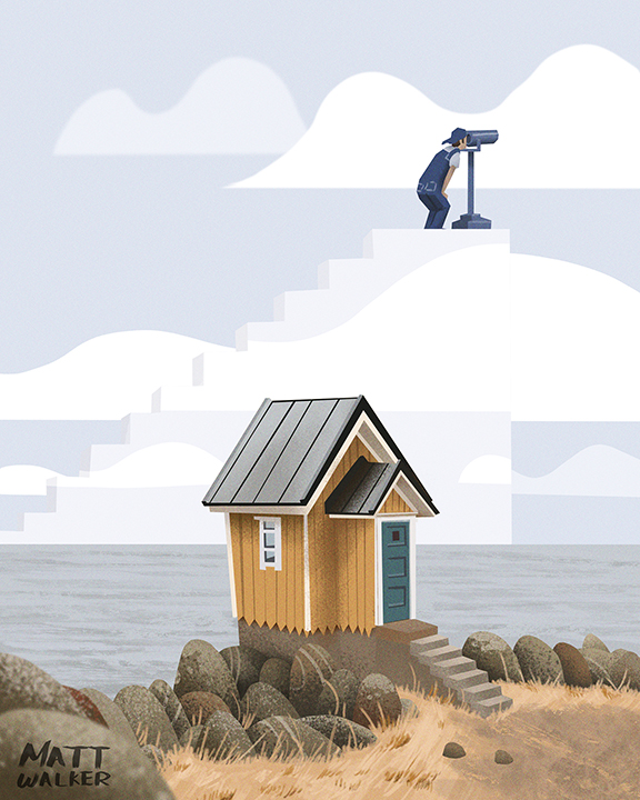
I had a one of those not-quite-awake-not-quite-asleep thoughts that so often come in the mornings and it inspired this piece. I thought it necessary to break away from the previous pieces that include the handyman character, not because I was bored of them, but because I’m a moron and couldn’t think of any new ideas. Since this idea was already pretty much fully formed I decided to roll with it.
On a side note I’m listening to audio-book of Stephen Fry’s “Moab is my Washpot”, the first of his autobiography books. It’s narrated by Fry himself and I think that makes it so much more interesting and engaging. The same can be said of Trevor Noah’s “Born a Crime”, which I’ve both read and listened to, and I would recommend doing both. I find it difficult to find the time to read these days with the amount of work I’m doing, so being able to listen to audio-books while I do some of the less taxing aspects of illustration is really nice.
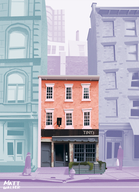
Anyway, this a real restaurant in the Tribeca area of NYC. Apparently it was built in 1810. That’s as much as I know. Enjoy!
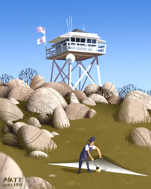
I’m not sure why, but this one took ages to get right. Above is the final version, and funnily enough it was also the first idea I had. However, as is often typical when planning pieces, I go through a series of roughs first in order to find something that is perhaps more well thought out or clever. I tried a version where the tower is on fire in an attempt at irony, but it didn’t sit well compositionally (I’m not even sure if that’s a word). I tried adding an FBI undercover van and entitling the piece “Who Watches the Watchtowers?”, but I wasn’t sure without the title whether people would get it. I tried adding a pile of used fire extinguishers – nope, then a caveman trying to make fire – also nope. I almost settled on someone carving Easter Island heads (they’re called Moai, so wikipedia tells me) from the rocks, but I thought people would try to read into the connection between the fire watchtower and the heads (there isn’t one by the way), so I scrapped the idea. I eventually settle on my first rough because it fit the series of illustrations I’d done previously. The best ideas I have usually come fully formed, but every now and again I really have to try and try, and it can be incredibly frustrating, and I just have to settle on a piece because if I don’t it’ll never get finished and I’ll never draw anything ever again… ever. A tad melodramatic perhaps. Anyway, I settled on this idea and I’m not sure what I think of it yet. I hope you enjoy it.
In case you hadn’t noticed, I’ve been sticking to a certain style recently. I’ve found that in the past the work that I post on social media and on here is “all over the shop”, for lack of a better term. If you came to my website I think you would be hard pressed to say what my area of expertise is… maybe expertise is the wrong word, perhaps “aesthetic” is better? These last few posts have been an attempt at creating a unified and recognisable brand for my online presence. Not all of my work will include the Handyman that’s been making an appearance so far, but I will at least attempt to keep the style the same. I think with all my previous work I’ve been experimenting and testing what works and what doesn’t – some are hits and some are misses, that’s just how it’s been. I think I’m finally working towards something now that is uniquely mine, and I think this is just the tip of the iceberg in terms of how refined the work is. I don’t doubt that you’ve seen very similar work elsewhere – Ty Carter, Szymon Biernacki, Scott Wills, and Brian Edward Miller are all hugely influential, and I feel like I borrow little bits from all of them. I’m committed to staying on course for the time being, building up a body of work, and seeing how far I can push these pieces. Anyway, I hope you’ve had a great day, and thanks for reading!
I’m enjoying doing these pieces. I believe they’re getting more and more refined as I do them, and rightly so; practice makes perfect, and all that. The majority of the illustration is a replication of an existing photograph, albeit my take on said photo. Because I’ve essentially copied a photo and just added some bits of my own, the question arises, “is true artistic originality possible?”
A site called Deviant Art did an interview with an artist a couple of years ago in which the illustrator claimed their art was original and not inspired or influenced by anything or anyone. I found this answer odd, because the artist used ink and watercolours to paint popular landmarks – surely then, they were inspired in some way by the landmarks themselves? Also, without some outside influence or inspiration, how was the choice of ink and watercolours made? As someone who has been making art for a while now, I know how vital the work of others (be that film, music, paintings, etc…) and the reference I use has been to my growth.
At the time of reading the interview I felt angry that someone would claim they were entirely original and uninspired in anyway, but as I processed what this person said, I came to two conclusions; one – they were wrong and the very work they had produced was a contradiction to their statement; two – true originality is a myth. That’s not to say something can’t be original in terms of being unique, but to create something that hasn’t been inspired or influenced in some way is impossible.
Anyway, thanks for reading my opinion on that. I was just going to talk about my process again, but I thought this might be a little more interesting. And as always, I hope you enjoy the work I’ve made. Cheers.
The above illustration is actually only the top half of a larger image. As far as composition goes I think this is an improvement on the original (see below). The reason for this is the reduced colour palette and the shape of the canvas. A limited colour palette tends to bring a piece together more harmoniously; there’s fewer colours to clash against each other and the use of values is more noticeable, thus you can be more subtle with their use.
As for the canvas shape/size, the key difference from the original is that the focal point for the viewer is much more clear – your eye is drawn to the window cleaner; he is in that right third (a compositional mainstay), and he stands out very clearly.
The image below is the original. While it’s not an awful picture, I do think there is a bit too much going on. It’s also not clear where the eye should be led, and I think it’s fair to say that the window cleaner stands out a lot less in this version despite the colours remaining the same. Suffice to say it would’ve taken probably less than half the time to complete this had I just painted the top half – you live and learn. I could be totally wrong of course, so feel free to let me know what you think in the comments. As always, enjoy!
Another study today. This one was a little more complex than the last one, because there’s more going on with the buildings. I injected a conceptual aspect to the piece with the torn paper, as it made things a little more interesting and leads the eye. I used the mixer brush in Photoshop to give the clouds a soft look which turned out quite nice. These pieces are fun to do and don’t require a lot of messing around since they’re a study of a real place, the only challenge really is how to incorporate a conceptual idea into it.
By the way, i’m going to be making some minor changes to the website in the coming weeks which will include a “shop” section where you will be able to grab prints of my work. You can still get prints for the time being by going through the “Contact” page and messaging me.